In the fall of 2016 I partnered with Digital Citizen and Mercury Media to deliver design and copy for Quay Australia's first digital campaign in the U.S. I began by doing a deep dive of Quay's social media imagery and language, eventually creating four distinct archetype personalities of women who wear Quay Sunnies. 


Simultaneously, I began to create potential tag lines and CTAs for a series of digital units. 

Once we presented these initial boards to the client and incorporated feedback, I got to work on creating two separate concepts in a variety of desktop and mobile ad units. The client wanted to highlight their lines of High Key sunnies (modeled by Desi Perkins) as well as their Super Girl sunnies. 


In March of 2016, media giant Condé Nast launched a massive branding awareness campaign—#CreativityIs, with videos, wild postings, and a full scale takeover of the New York City Grand Central Station MTA Subway stop. Condé Nast's headquarters are at 1 One World Trade Center in Lower Manhattan. Myself and my design partner were in charge of planning, designing, revising, and proofing this entire space. The project took over six weeks to complete.


Design and copy writing for Mr. Clean's Magic Eraser full page advertorial, which ran in June 2015's issue of Car and Driver.


I teamed up with Dimitrious II to help rebrand the Key Art for Green Depot. This Project included both a redesign of Green Depot's logo, as well as rebrand to all Key Art for both the "Build" section for contractors and the "Live" section for House and Home of their Company. 

Green Depot's Mission is to make "green" building and living solutions accessible, affordable and gratifying. Founded in November 2005, Green Depot is a leading supplier of environmentally friendly and sustainable building products, services and solutions.

I was tasked with reimagining their logo (while incorporating elements of the existing logo) and changing their key art to seamlessly marry elements of both their home and work business focuses. 

As part of the key art I incorporated new subcategory branding. The icons are for Energy, Conservation, Responsibility, Air Quality, and Local. The final key art was displayed within the revealed print ads. 


Estée Lauder was a 2010 launch partner for a rebranded Vogue.com. Our task was to create a new multi-tiered campaign to showcase their new pure color line of products. On The Scene” was a microsite launched for street fashion at different fashion weeks around the world. Women in Shanghai, Paris, London, and New York were photographed by street fashion photographers, and site users could like and comment on each photo, as well as link off to shop different Estée Lauder products that would allow users to get the look each women in the photos had. The site’s construction was significant at the time because I designed it to have an “infinite world” feel with no scroll bars before gyroscopic technology was commonly used on web and ipad. The ad units, which linked to the site, mimicked the same feel.

Awards
Internet Advertising Competition: Best Retail Integrated Ad Campaign.


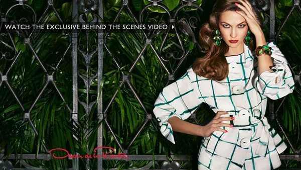
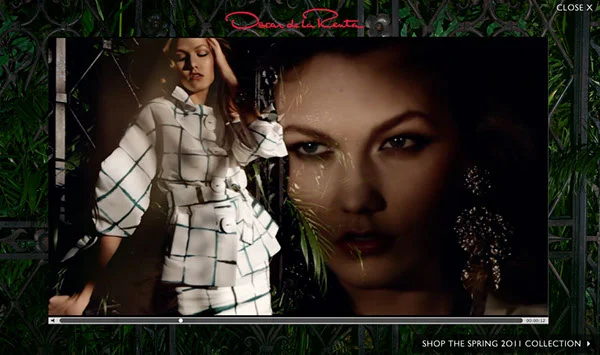
Oscar de la Renta was an initial partner for Vogue.com's 2010 relaunch. This included pushdown units and a video for their new fragrance Espirit d'Oscar. When the unit expanded, the user could watch the BTS video detailing how to use the fragrance was constructed. 


Michelin, the world's leading name in tire technology partnered with FIA Formula E to bring the first ever full-electric racing series to major cities around the globe in 2014-2015. I was tasked by Car & Driver magazine for Hearst Publications to craft the copy and design for a Car and Driver magazine cover wrap, an online sweepstakes page, and banner ads.


Below is the finished design.

From Track to Street, Michelin’s New Tire Sparks a Racing Revolution


Headline

You Could Win a Trip to The Formula E Series In Miami


Body

Race-car drivers are strapping in for the first season of FIA Formula E’s single-seater racing championship with Michelin’s new avant-garde tire,The Michelin Pilot Sport EV, the world’s first all-terrain, all-weather tire. Michelin’s rubber innovation is equally at ease in dry and wet conditions, as energy efficient as that of The Pilot Series road tire when it comes to weight, dimensions, compounds, sipes and tread, and has the same 18-inch diameter as UHP vehicles. It’s the only tire that can quickly and efficiently transition from street driving to a race car track. To prove it, Michelin is putting these tires to the test in nine different cities during FIA Formula E’s tour. The world-renowned tire makers are utilizing FIA Formula E’s fully-electric race series as a high-speed, high-intensity laboratory to test the Pilot Sport EV’s ability to seamlessly transition between road and track, and between wet and dry. The manufactures of the Pilot Sport EV are so confident in their work that during the race each driver will only be allowed to enter pit lane once to change cars, meaning that except in the case of a puncture, no tire changes will take place. Michelin is utilizing FIA Formula E’s fully-electric race series as a high-speed, high-intensity laboratory to test the Pilot Sport EV’s ability to seamlessly transition between road and track, and between wet and dry. Keep in mind that the zero emission Spark Renault SRT_01E car being used by all drivers in this championship boasts a lithium ion battery linked to a five-speed paddle-shift transmission with a maximum power output of 200 kW (270 horsepower). Each car can accelerate from 0-62 MPH in three seconds and has a top speed of 140 MPH. That’s manufacturing confidence worth seeing in person.


Sweeps Entry Copy

Get ready for a chance to be a part of the ongoing new generation of high-performance and high-adrenaline street racing with Michelin for FIA Formula E. This racing series is the first of it’s kind, as ten teams and twenty drivers race fully electric Spark Renault SRT_01E single-seat race-cars on temporary street circuits right in the heart of some of the world’s most-renowned cities. One lucky contestant will win: 


An all-expense paid trip to Round 5 of the Formula E race in Miami on March 14, 2015.

Complete behind-the-scenes access at the race.

The opportunity to chronicle your experience, live, for Car and Driver/Road & Track via social media. 

Your own private photographer, who will follow you around, capturing these once-in-a-lifetime moments for an advertorial to be run in the May issue of Car and Driver. 

Second prize will win a set of four Michelin tires. (exact copy on tire to be supplied by client)

Third prize will win premium leather racing gloves.


CTA

To enter for a chance to be a part of racing history, go to:  www.FormulaESweeps.com 

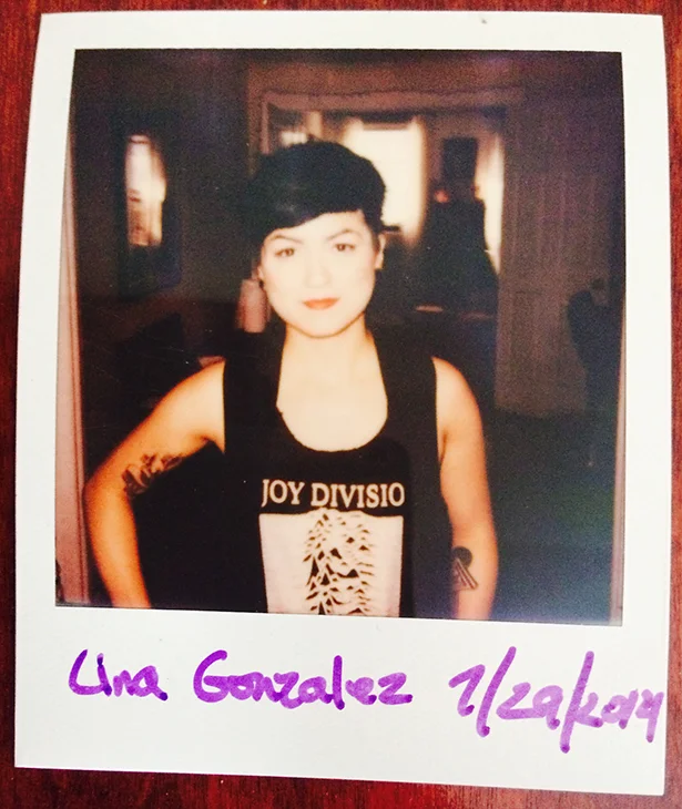
In the Summer of 2014 I finally decided to get off my butt and record the first batch of interviews which later became Breaking Walls. I knew that my friend Lina Gonzalez had just been to London on a half-work, half-play adventure, and I knew she was working a day job that wasn’t the direction best-suited for her passions. That’s not to say it was a poor job, she was just a poor fit for that specific role. Lina was a perfect interviewee for EP02's topic “How To Stay Creative When Your Surroundings Limit It.” I reached out to her. She was very into the idea of the podcast. Throughout the course of the interview it became apparent to both of us that not only did our parallel yet perpendicular passions and personalities make for great friendship, they also made for a great creative partnership. After we were finished recording the interview we spoke about the things we wanted in life and what we thought The WallBreakers could become. Sparks flew and a partnership was born.


Looking Back to Look Ahead: The previous version of The WallBreakers was dying a slow death. The internet is saturated with Tumblr and WordPress sites like Boooooom, This Is Colossal, and Design Milk that eloquently write about other people’s creations. I love those sites, and they had established a voice long before The WallBreakers existed. My voice was drowning. That wasn’t what I wanted. I was trying to keep The WallBreakers at status quo for as long as possible until I could figure out where to take it next. The Breaking Walls podcast series was the first big step in that direction. This community needed to evolve. Lina walked in like a breath of fresh air and our synergy was so immediately evident that we got to work on rebranding the community within a few days.

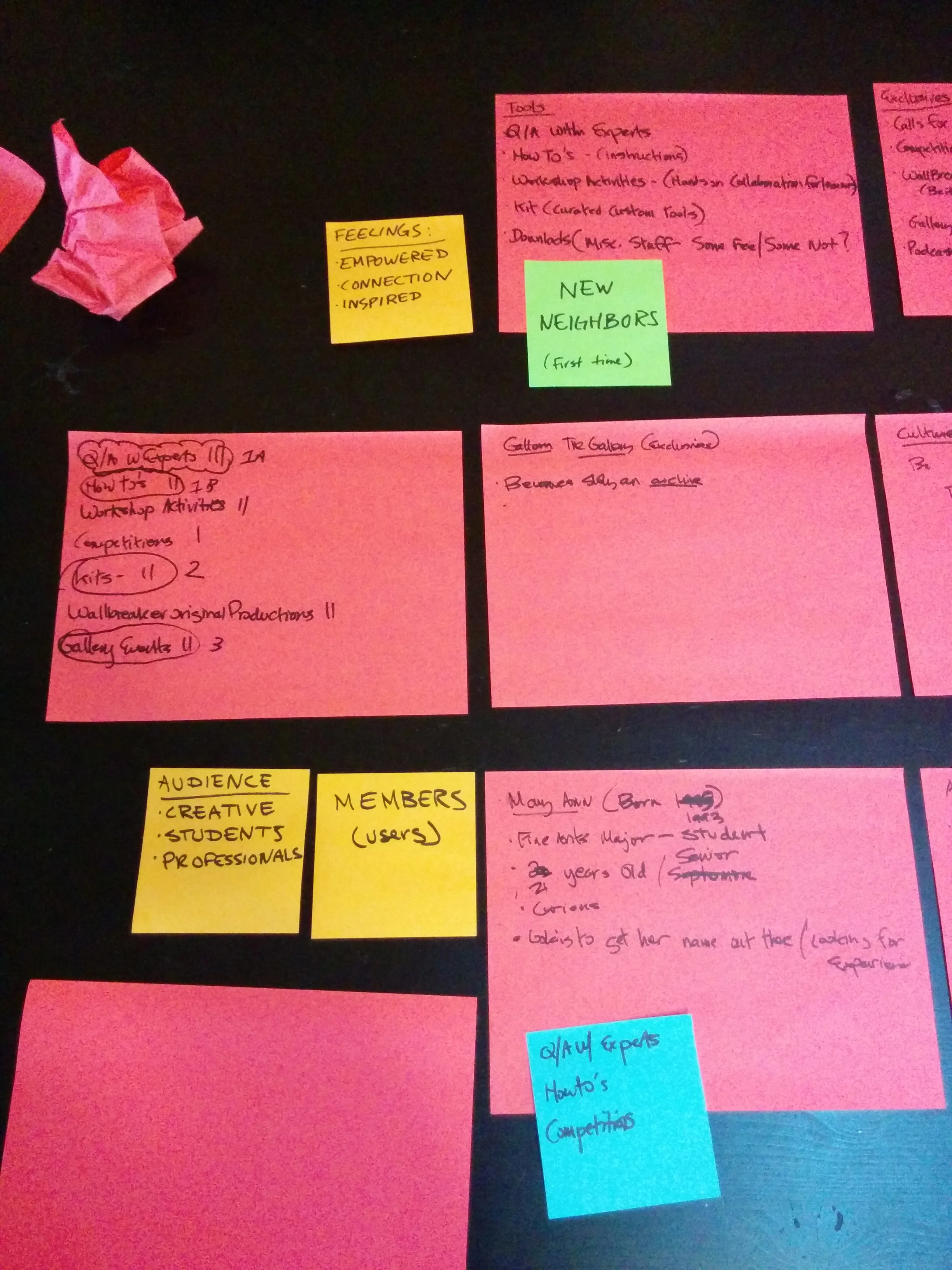
What could this new version of The WallBreakers be? What would make people want to come to The WallBreakers 2.0? After much brainstorming (and post-it notes!) we decided the community needed to help give its members “tools for a breakthrough career.” We came to this because so many professional creatives leave college having no idea who they are and what they want to do next. For most that really only changes with trial and error. If we don’t know what we want or how to get it, how can we improve our situation? We have all worked a dead end job or two and while we all learned something from it, if there was a way that Lina and I could help educate people as to what their passions were and how to find them, we could in turn create a more mobile, inspired community.


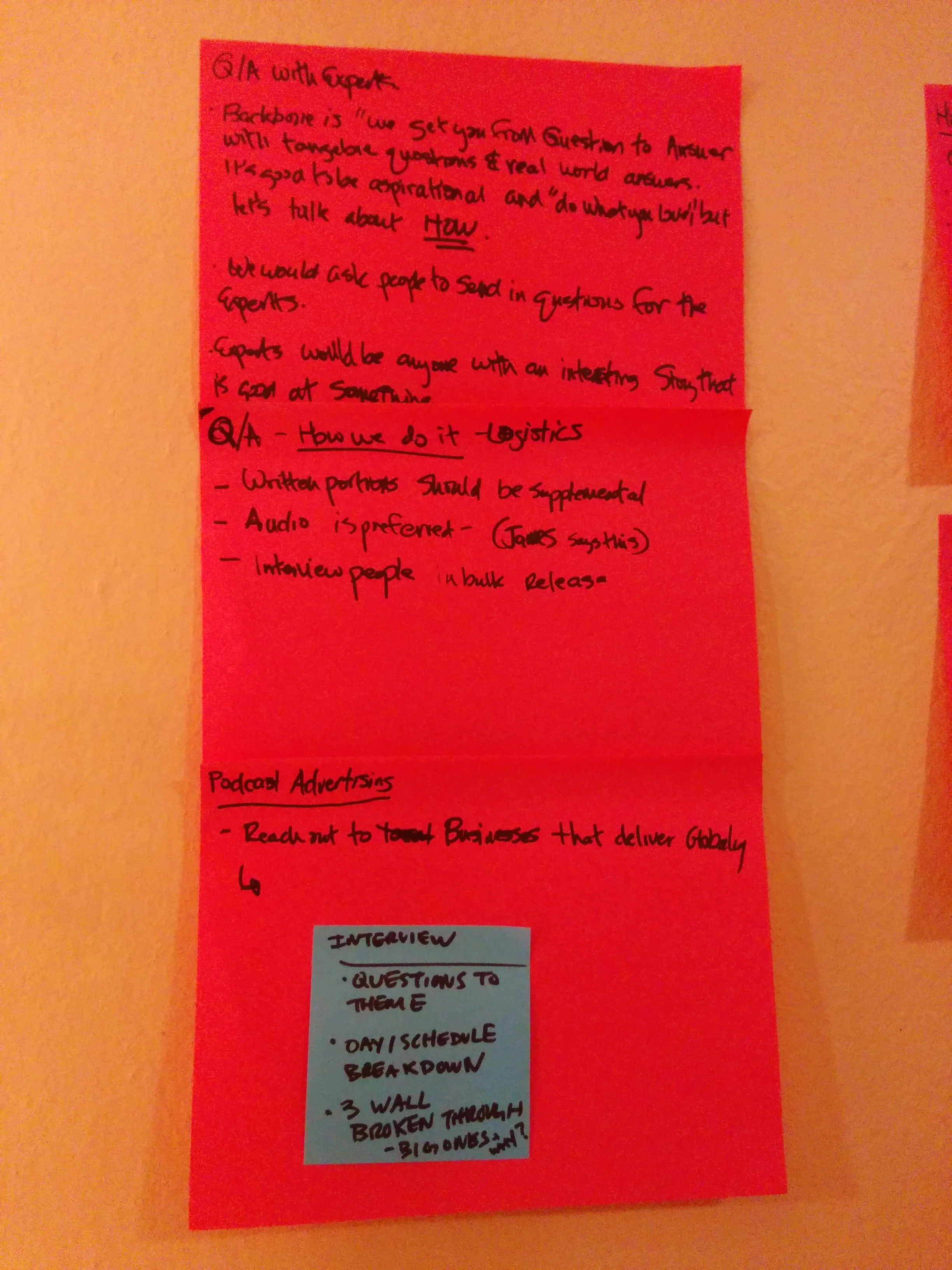
Laying The Groundwork: The new community had a few lynch pins. One of my struggles with writing for the previous version of the community was the kind of content I was publishing. There was no rhyme or reason to it. That’s not a recipe for holding an audience's attention. Lina and I sat down and thought about how we could have the community's content evolve organically. Did you know that every month has a major event built into the calendar? These calendar events also mirror the passage of time. We begin the year anew and end with taking stock and looking ahead. As the seasons change, so too do our interests and how we feel about our place in the world that surrounds us. What if we got to the heart of each event? For instance, February’s major event is Valentine’s Day. Sure, that’s a commercial holiday, but its core value isn’t. Valentine’s Day is about love, and love is about vulnerability. We can’t love if we’re not willing to be vulnerable. All of the content produced in February centered around ways to improve our comfort with being vulnerable. Each month, the overarching theme changes based on a major event within the month.

The best part about all of this is that because I am taking an active part in the content, my own life mirrors the calendar we have for the year. We basically set up keyframes that will guarantee personal growth. How awesome is that? We’re all in this together.


Design Explorations: The WallBreakers community originally launched on February 1, 2012. Our goal was to relaunch the community on our third anniversary. This gave us a short timeline to work towards. We needed to get moving! 

The Original WallBreakers logo was a swinging wrecking ball. The color scheme was a deep yellow with black. Looking back now, the site was visually overbearing. How could the emotional tenant that a wrecking ball in motion evokes be communicated in a less blunt and more sleek, streamlined way? 

The first thing we did was take a look at sites that inspired us either with their visuals or with their content. We took a look at places like DesignWorkLife, TeamTreehouse, Good, 99U, and Behance. We made sure to think about layouts, scalability, UX, and UI. Next we took a look at different logo and trademark inspiration. LogoPond is a fantastic resource to do so. We then took a site audit of the previous version of The WallBreakers site, taking stock in both the positives and negatives. Afterwards we put together mood boards. 

It turned out that the yellow and black didn't need to go after all! Yellow was a great signifier for my personality, whereas teal was a wonderful color for Lina's personality. I think it's important to remember that life is a lot like a hand of poker. It's not always prudent to throw the entire hand back, sometimes we only need to draw two cards (#deepthoughts). 

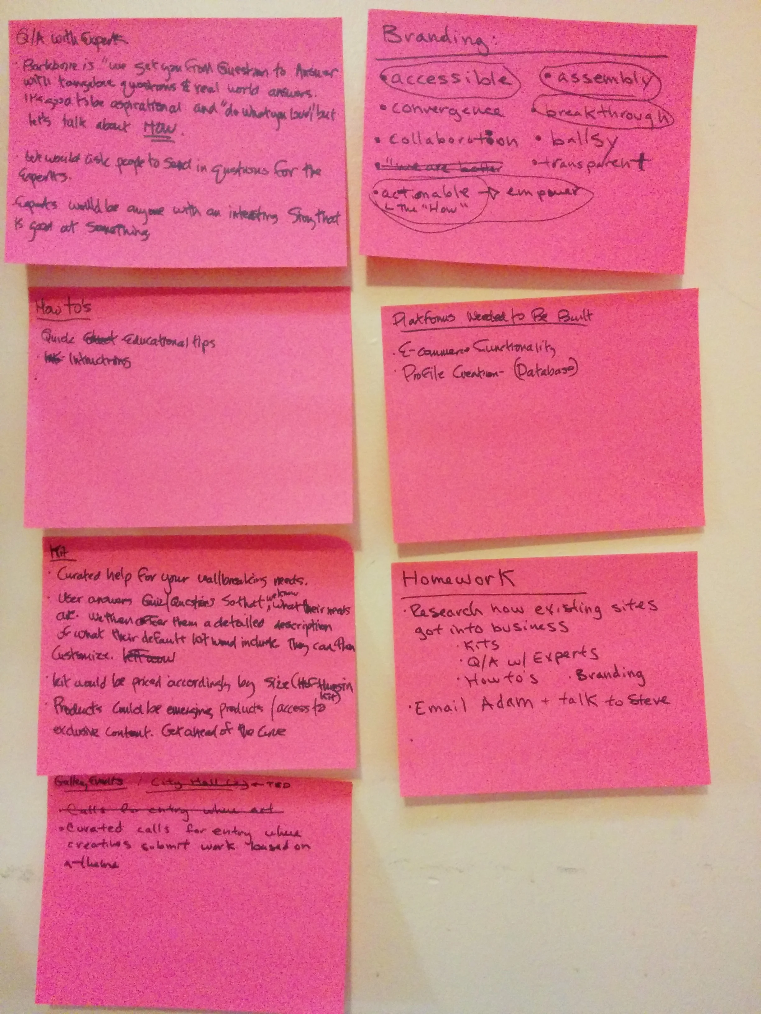
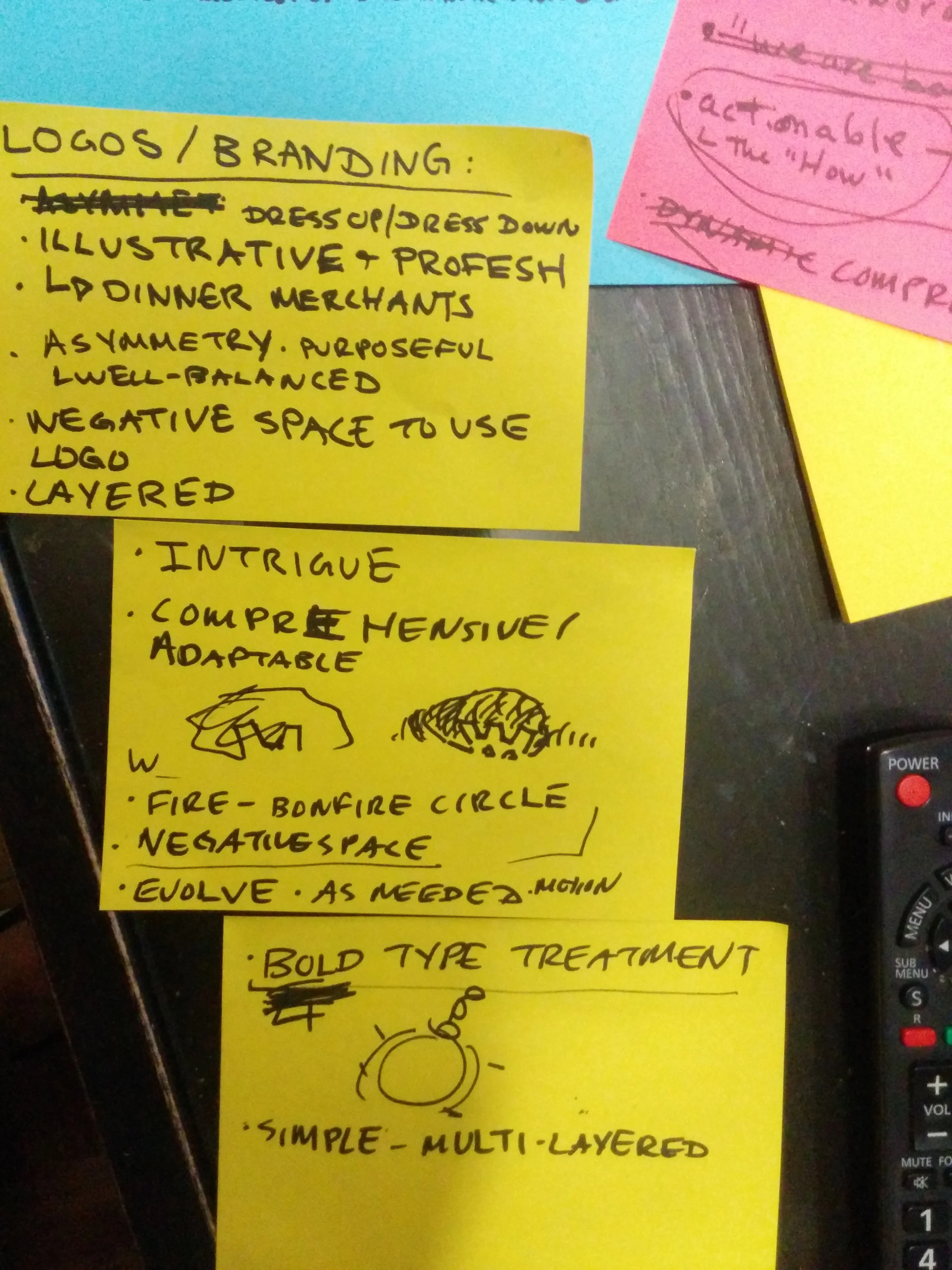
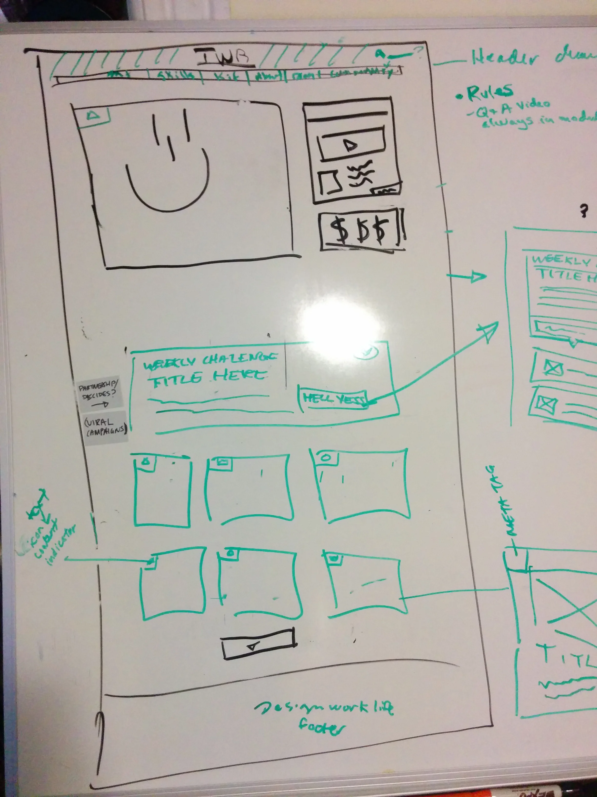
Following our explorations we began to put the bones together for the updated community. Our many post-it notes yielded great information for both a site map and a user interface experience. As we worked on this, we also began to come up with different logo explorations. We settled on a type treatment that we could easily reproduce regardless of the setting. Like a good parent, the logo needed to be impactful, yet loving. We wanted it to feel strong and breathe well at the same time. 

By using a knocked out logo with a colored drop shadow, it allowed us the ability to place our logo on various site headers for our revolving monthly content. A variation of number five on the left was our winner.

Another major branding element we incorporated was the idea of crashing waves. Bruce Lee once preached to "be like water." Water can be powerful and destructive when necessary, but it can also be serene and serendipitous. 


By the time the clock struck midnight on January 1, 2015 we had a finalized logo, a site design, and put together a coherent site grid and style guide to share with other creatives. The month of January was spent writing content, connecting with artists to feature, recording video content, reaching out to the community to be a part of the launch-day welcome, Q/Aing the new site, and tying loose ends. 


Before I could think about what the WallBreakers could become, I first needed to understand what it was. I've been fortunate enough in my career/life to have taken part in multiple communal branding efforts. At the onset of brainstorming and early in the branding process it always feels like a massive undertaking, but by being present, taking things one step at a time, and being diligent, that on-time project launch euphoria always gets experienced. 

Homepage takeover for Fig Newtons linking to a blog about health, life and fruit called "The Fruitful life." The takeovers ran on Concierge, Epicurious, The New Yorker, Vanity Fair, Bon Appetit, and Golf Digest.

In September 2009 DailyCandy.com was completely revamped and relaunched, turning into the new one-stop for what to do, shop, see, and eat in your city and beyond. I was hired at the beginning of the relaunch process and got to work first-hand with an incredibly talented team of UX designers, front-end and back-end developers, and award-winning editors. These are some of the pages I designed for the relaunch. 


55DSL x 686 Snowboarding Collection Launches With Dope Moshpit Short Film


This article was originally published through Vice Media's UK blogger network.

So long as there are youths with big hearts, big dreams, and something to prove, there will always be a counterculture movement and fashion that goes with it. Rock music with it’s leather and denim, and snowboarding with its need for risk takers willing to defy gravity to catch some good air, are two examples of such movements. In this vein, 55DSL and 686 have joined forces to create the ultimate snowboarding collection in a launch so epic it needed the perfect moshpit short film to accompany it.


In true 55DSL fashion, the brand has once again collaborated with vital, young creative talent. Director Stephen Agnew is responsible for music videos for the likes of Drenge and The Vaccines, whilst graphic artist Ruff Mercy has lent his hand to projects by Disclosure and Mary J Blige.


The 55DSL x 686 “Moshpit” video turns the gaze of ultra-slow motion cameras to a wild, un-hinged circle pit, set to doomy guitar riffs and reverb-laden drums. Shot in a South-London warehouse space, “Moshpit” is an examination of what happens when bodies collide in the midst of the heaviest hardcore punk gigs – every detail from beads of sweat to rippling guitar stings are caught in super high-definition slow motion. It’s right in line with what our young generation feels on a day-to-day basis. We want to live our lives in the most sensual way possible. We want to feel everything, see everything, do everything, and this new collection from 55DSL and 686 helps do just that.


The Polyfill stuffing provides warmth, but doesn’t restrict arm and leg movement. The removable sherpa-lined hood with the brushed shoelace drawcord lets you rip it off at the bottom of a sweet hill and yell, “hell yeh, I just did that!” The dual chest pockets and zippered thigh pocket allow you to hide whatever you don’t want anyone to see. The best part? Because this collection has been made with our denim rock gods in mind it’s got the feel and hem of something Brando, or Presley, or Jagger, or Strummer would have worn. It’s the perfect attire to be a rebel with a cause.


Check out the Moshpit video above, check out some of the sweet BTS shots below, and be sure to SHOP THE COLLECTIONS AT 55DSL HERE!

Copywriting and design for a potential Gatefold within Popular Mechanics. The right spread "What's In this Bag?" would unfold to reveal two additional spreads outlining the benefits to using Rubbermaid's Brute trash bags over all others. 


Brute_Spread_1.jpg
Brute_Spread_2.jpg

The 26ft. Jack Daniels Whiskey Barrel Tree is Up and Ready to Spread Holiday Cheer!


The following advertorial was originally published as part of Vice Media's UK blogger network. 

The holidays are all about family, sharing, and caring. I’m pretty sure we all have our own heart-warming and unconventional holiday traditions. As much as I love decorating the tree, my favourite part of decorating for the holidays has always been getting to decorate the house. Poinsettias, red bows, nutcracker figurines, special holiday candles, indoor wreaths, tablecloths, and all kinds of holiday bric-a-brac have made their way into my family’s lexicon over the years. We even put up an huge ceramic Victorian Christmas village. It’s gotten so elaborate that a few years ago we had to lay out a grid system. There’s nothing that says “the holidays in New York” like a ceramic Victorian Christmas village with good city planning! That doesn’t even account for the ridiculous outdoor decorations we put up. No matter who you are, you can appreciate the sense of community and togetherness the holidays bring about.


The people who live in Lynchburg, Tennessee have their own giant outdoor decoration. Each year Jack Daniel’s brings the entire town together to construct a giant Christmas tree out of empty Jack Daniel’s distilling barrels. What’s more fun than constructing a giant Christmas tree in the middle of town? How about decorating it! The sense of pride and happiness felt by the people in Lynchburg is encapsulated in this glowing beauty of American hard work and ingenuity. It’s also a good excuse to do something everyone can enjoy. As the folks at Jack Daniel’s tell us, “We’ve always done things our way, and the holidays are no exception. Here at the Jack Daniel’s Distillery we’ve never been the type to follow the norm. That could be why our ‘tree’ is anything but traditional. Standing 26ft tall and made entirely of barrels, it’s a seasonal sign of good times, good friends and damn good whiskey. Despite its unconventional nature it has a way of drawing folks closer together, much like the spirit it once housed.”


Got your own happy unconventional holiday tradition? Jack Daniel’s would love to hear it! Share it with them at HTTP://TRADITIONS.JACKDANIELS.COM for a chance to win hundreds of prizes. Stories involving irresponsible drinking will be disqualified, so focus on the things that make you or your family completely unique. Think hard, we all have them, and I’m sure those memories will bring a smile to your face! Oh, and remember to celebrate joyfully and drink responsibly. Happy Holidays!

Giffgaff x Halloween – When You’re Scared, You’re Not The Boss #alltheboss


Screams, damsels in distress, scary horror music. It's Halloween, but with a giffgaff twist. #alltheboss This is pretty scary, so if you don't like scary things, don't watch it.

The following advertorial was originally published as part of Vice Media's UK blogger network.

The last thing you want to have happen to you when being chased by zombies this Halloween is to have no service on your cell phone! Luckily, giffgaff has you covered, literally and figuratively. They’re not without a sense of humor too, as the above video dictates.

This Halloween giffgaff is pulling a little trick ‘n’ treat by putting together a selection of classic horror figures, proving that “you ain’t the boss when you’re scared.”

They had this to say about the production: “Filmed on location in the rather disturbing Trent Park, home to numerous rotting corpses including a Ghost Earl, and Alice (a six year old girl who can be heard singing in the Stables) we’re cooking up some Halloween action.” When you mix that atmosphere with an insane clown, prison escapee, and a terrified girl, you’ve got the perfect ingredients for a fright night flight!

Staying on brand in a fun way by scaring and making their audience laugh is becoming giffgaff’s habit. Last year’s “Different Takes Guts” production saw one-hundred people throw blood and guts at each other in a disused swimming pool. Needless to say, it got banned! Nice work. So here it is! Get ready to laugh until you faint. Happy Halloween!

A series of desktop 300x600 and tablet (Ipad and Samsung Tab) ads for Zappos.com allowing users to create their own Zappos inspired ensembles, which ran on TheNewYorker.com and Glamour.com.  Each article of clothing illustrated corresponded to an actual article of clothing sold through Zappos. The user could then click off to Zappos.com to buy that article of clothing.


A sweepstakes containing a quiz generator, along with a mircosite where brides-to-be could answer a series of question relating to how their fiancé proposed. Contestants entered for a chance to win a series of prizes from Lenox. This program ran on Brides.com


A series of expandable units for Timberland's Eathkeeper's Collection. 


Homepage takeover and expandable ad units for Burt's Bees new Sensitive Skin line.


A sidekick unit announcing the latest round in BMWi innovations which ran on the now defunct Details.com.


One of the first condemned buildings to be completely rebuilt with all sustainable materials, 93 Nevins in Brooklyn is an inspiration to those who think that good things can't happen.

In 2004, before many of the current green guidelines had been formally established, local Brooklyn developers Rolf Grimsted and Emily Fisher set out with genuine intent. They would improve their neighborhood by taking over a highly-toxic, dangerous building – derelict for 20 years – and recreate something new, something “aspirational.”

They decided to create two contemporary residences that celebrate Brooklyn townhouse living. Their goal was to design and build 93 Nevins/453 Pacific to be as “green as possible.” They weren’t sure what that meant, exactly, yet they were willing and eager see just how “far” they could go. Thus, spurred on by a team of passionate idealists, the “great adventure” at 93 Nevins began… and continues today!

I was tasked with designing the website for this health house - http://www.93nevins.co